SAM FOX SHOPS APP
The Sam Fox Shops app is a hypothetical mobile application for the Sam Fox School shop network that encourages exploration, facilitates collaboration, and allows students, faculty, and technicians to utilize the resources across all six shops. The app allows users to reserve equipment and space in the shops, and offers trainings and education resources. This project was created using Google Material Design and Figma.
Advisers: Jonathan Hanahan, Molly Needelman, Aaron Zemach, Will Bates
View full prototype︎︎︎
Process
Project Task
The project task was to create an application for the Sam Fox School shop network that allows users to utilize resources across all shops. The application needed to account for COVID-19 restrictions, yet could continue to be used when those restrictions were not needed.
The existing shop reservation system has no consistency in communication, reservations, trainings, or expectations for students, faculty, or monitors across shops. Users complained that it was clunky, difficult to navigate, and that it often required extra searching in order to discover the room number, which is required to reserve time on equipment.
The existing shop reservation system has no consistency in communication, reservations, trainings, or expectations for students, faculty, or monitors across shops. Users complained that it was clunky, difficult to navigate, and that it often required extra searching in order to discover the room number, which is required to reserve time on equipment.
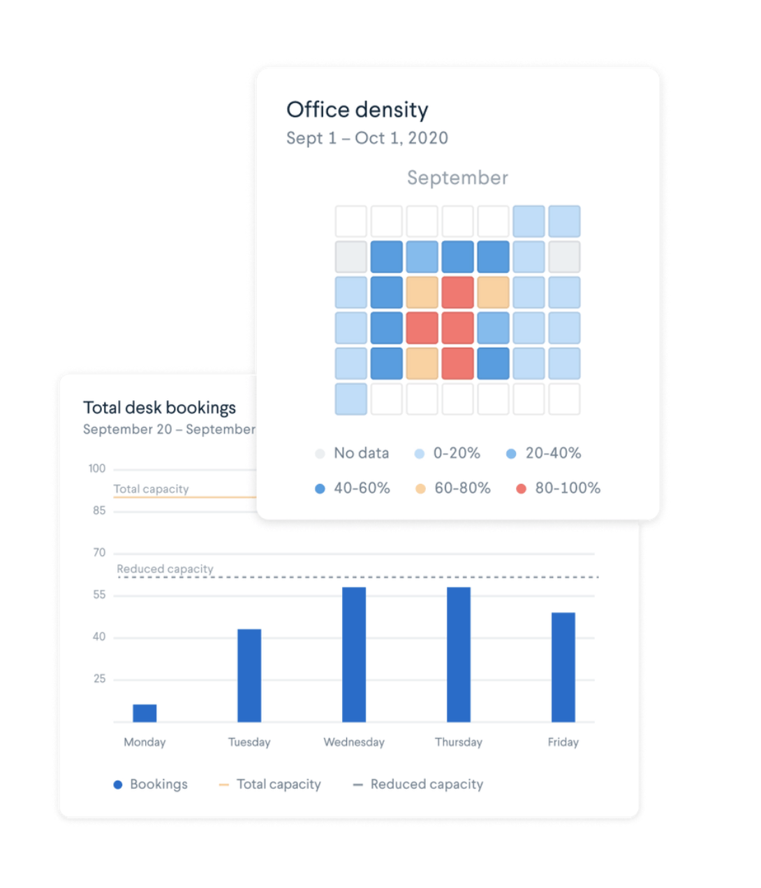
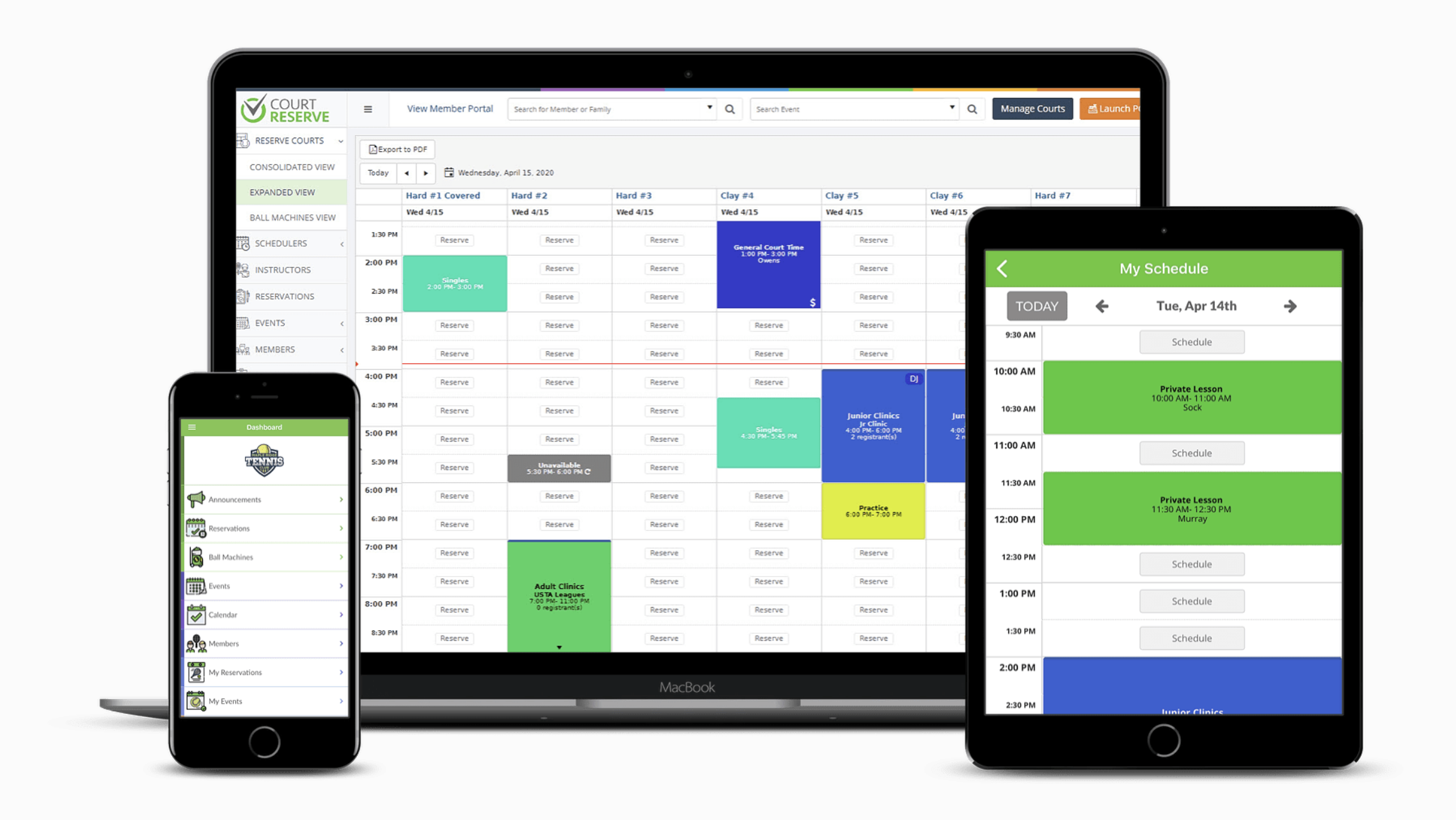
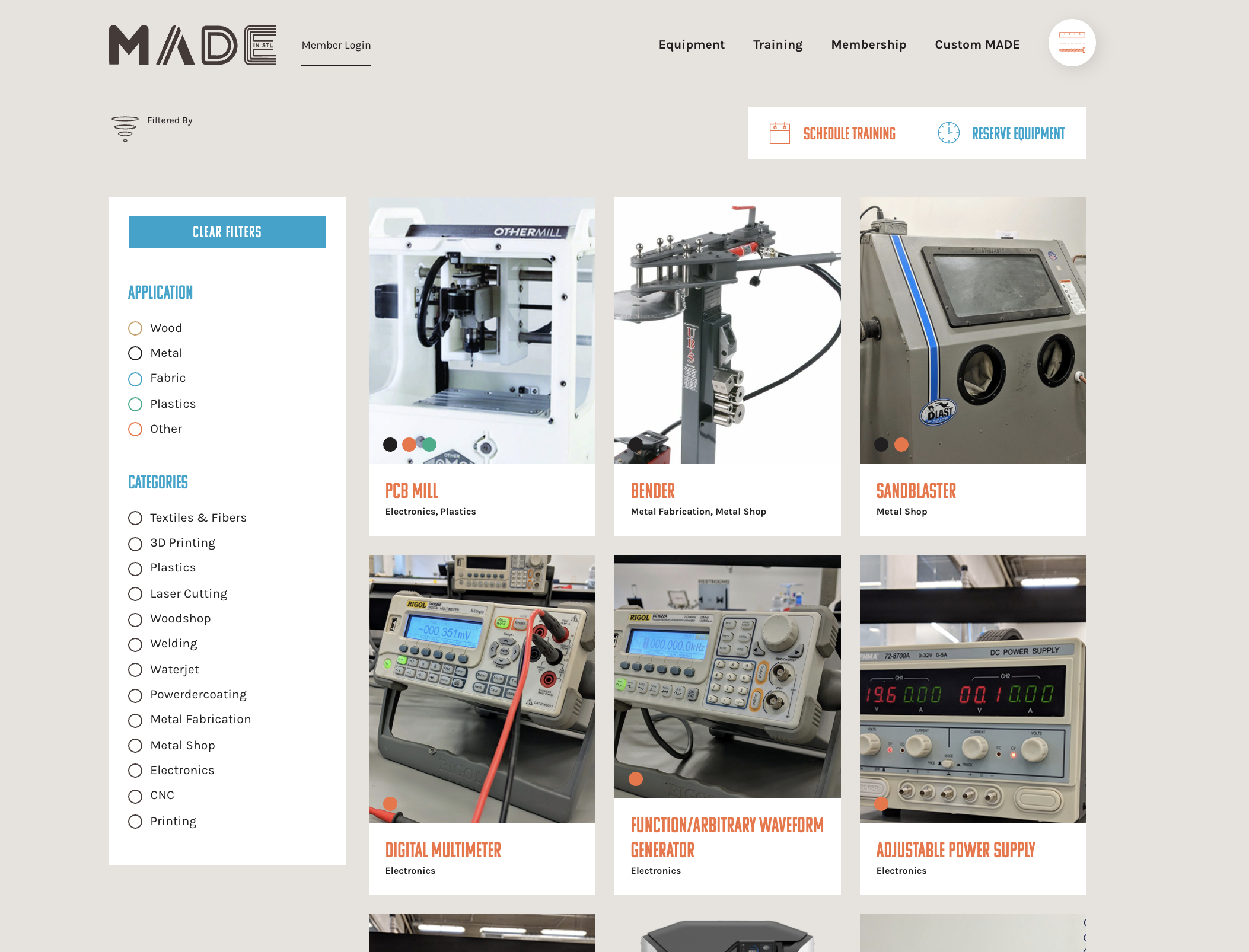
Secondary Research
User Research
I led two group interviews with shop technicians, faculty members, and my peers to better understand the user’s experiences. I also re-watched three other interviews that my peers led to gain a more comprehensive understanding of various experiences.
One of my favorite parts of this project was engaging with the users and hearing about their experiences. Grounding design decisions in the information and stories they shared was critical to this process.
One of my favorite parts of this project was engaging with the users and hearing about their experiences. Grounding design decisions in the information and stories they shared was critical to this process.
Key Takeaways
While I cannot emphasize enough the insight gained from the user interviews, some of my key takeaways included...
1. Social interactions make or break the experience, and knowing the shop technicians/monitors helps build confidence in student/faculty users.
2. Shop stereotypes can make them more or less welcoming to people.
3. Time usage varies between shops, and each shop has a unique culture.
4. New and experienced users utilize the shops and go through trainings at differing times.
5. Shops are currently inaccessible; access is only available if one has taken a class or reached out personally to a shop technician.

Observations & Synthesis
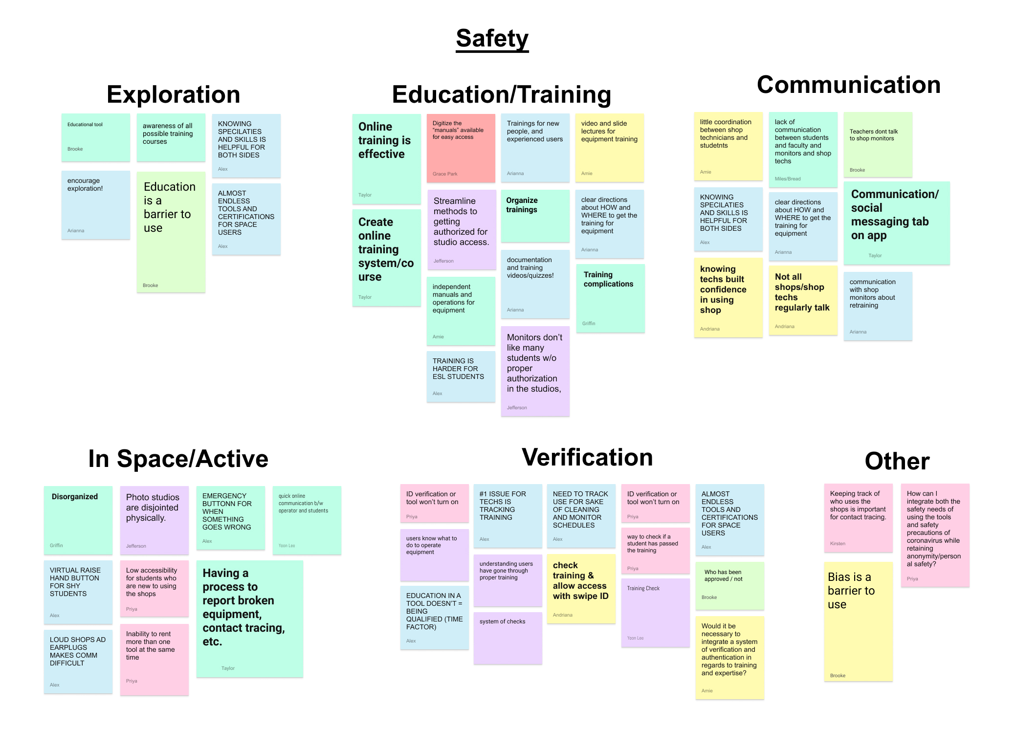
As a class, we gathered our surprises, questions, observations, and actionable items from the user interviews.
While this was an independent project, working in small groups to discuss our observations and insights helped process the information gathered through user interviews.
While this was an independent project, working in small groups to discuss our observations and insights helped process the information gathered through user interviews.
Class Themes & Insights
Through the synthesis discussed above, our advisors identified five core themes that we dove into further: communication, availability, community focused, flexibility, physicality, and safety.
By grouping the observations, we were able to derive insights that informed our design decisions.
By grouping the observations, we were able to derive insights that informed our design decisions.
Refined “How Might We...”
How might we facilitate smarter interactions that encourage exploration and build confidence in new and experienced shop users?
User Flow
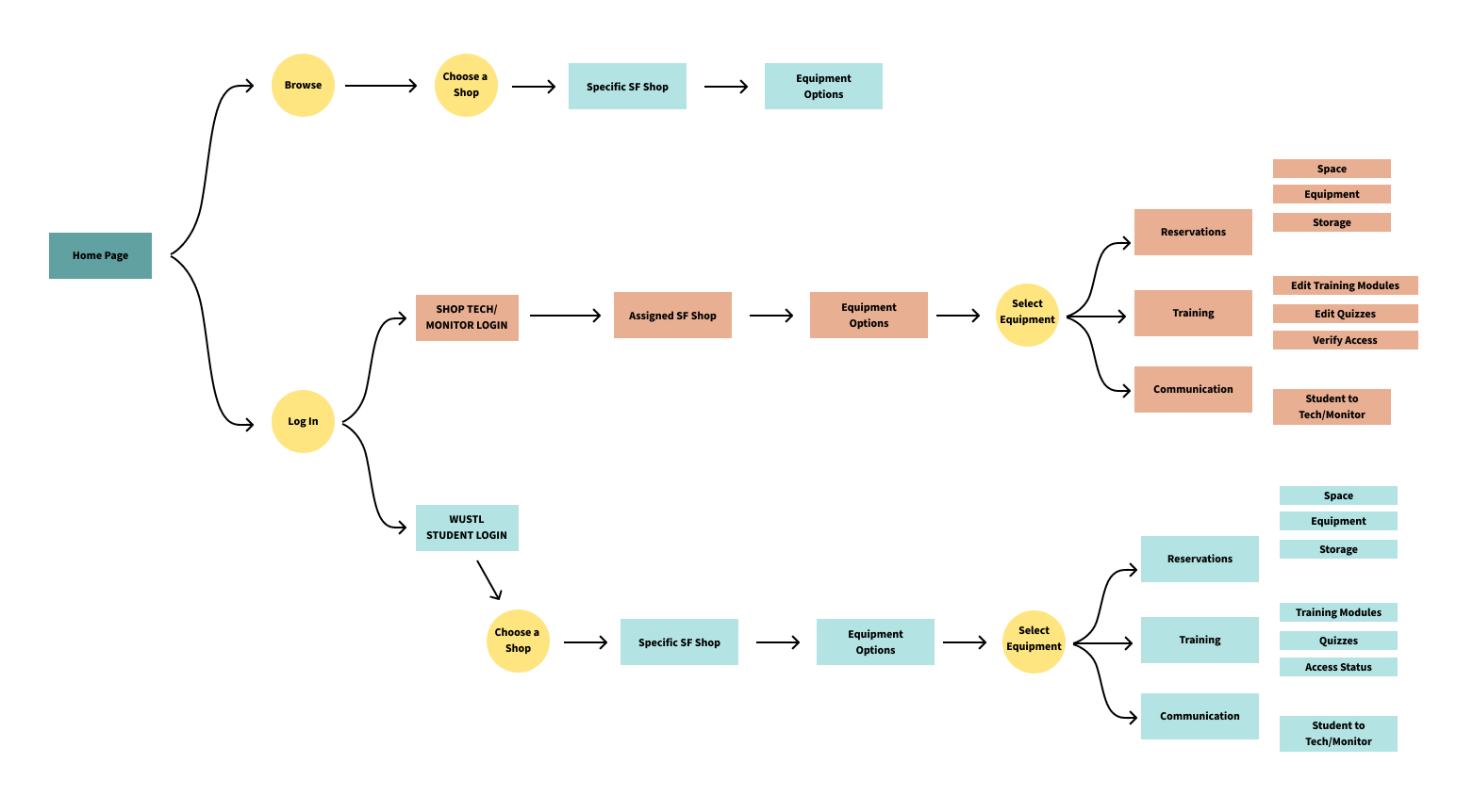
I built out a user flow to establish the overall structure of the app.
Also, I established two primary user paths to focus on: one of an experienced user who wants to schedule a time to use their favorite machine, and one of a newcomer to the Sam Fox shops who does not know where to find a specific piece of equipment.
Also, I established two primary user paths to focus on: one of an experienced user who wants to schedule a time to use their favorite machine, and one of a newcomer to the Sam Fox shops who does not know where to find a specific piece of equipment.
Usability Research
Over the course of several rounds of usability research, I applied feedback from shop technicians and student/faculty users, as well as people unaware of the goals about the project.
Two main techniques used during user testing were the “think-aloud protocol” and hi-fidelity prototype testing.
Two main techniques used during user testing were the “think-aloud protocol” and hi-fidelity prototype testing.
Key Features
Explore By...
To encourage exploration and facilitate a variety of ways to find what users are looking for, I created a centralized “Explore By...” section where users can search by material or by location.
Through user interviews, people indicated that Sam Fox specific lingo is often used when talking about the shops (ie. “You should check out Givens” or “Try out the CNC for that project”). By using this existing language, in addition to original shop names, the app helps to bridge the gap between new and experienced users.
Through user interviews, people indicated that Sam Fox specific lingo is often used when talking about the shops (ie. “You should check out Givens” or “Try out the CNC for that project”). By using this existing language, in addition to original shop names, the app helps to bridge the gap between new and experienced users.



Check In &
Check Out
Check Out
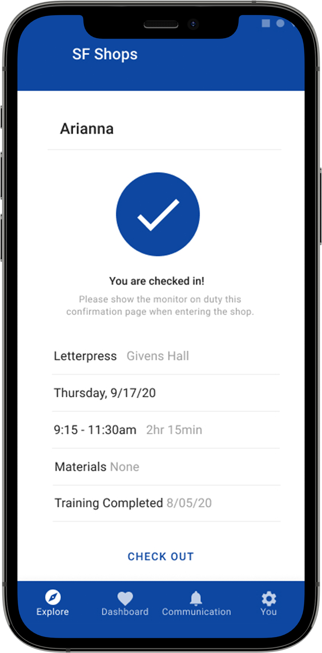
In each shop, there is a monitor on duty during open access hours. These “check in” and “check out” pages that can be pulled up on one’s phone and shown to the monitor on duty when entering and exiting the shop balance fluidity and ease of shop use with safety and accountability.
To get to the “check in” page, the user has to have completed their training and made a reservation. As a result, the monitor can easily glance at or request to review a user’s “check in” page to ensure they are properly equiped to be using the space. A concern that a shop monitor voiced was that a lengthy check in process would deter students from using spaces properly. The ease of pulling up these pages help to combat this potential problem.
To get to the “check in” page, the user has to have completed their training and made a reservation. As a result, the monitor can easily glance at or request to review a user’s “check in” page to ensure they are properly equiped to be using the space. A concern that a shop monitor voiced was that a lengthy check in process would deter students from using spaces properly. The ease of pulling up these pages help to combat this potential problem.
Accessibility & Community
One point that arose from user interviews was the idea of intimidation when reserving or entering shops. To mitigate this intimidation and increase accessibility, confidence, and a welcoming environment, shop specific pages in the app provide images, information about offerings and available equipment, and information about shop techs and shop monitors.
Shop tech/monitor pages serve two functions: to increase familiarity through information and to highlight their unique interests and specialities. The shop techs and monitors are vastly knowledgable and eager to help students/faculty, but their experience is often unknown by students/faculty. Having designated pages and clear communication helps to build community confidence within the shops and around the Sam Fox School.
Shop tech/monitor pages serve two functions: to increase familiarity through information and to highlight their unique interests and specialities. The shop techs and monitors are vastly knowledgable and eager to help students/faculty, but their experience is often unknown by students/faculty. Having designated pages and clear communication helps to build community confidence within the shops and around the Sam Fox School.


Equipment Pages
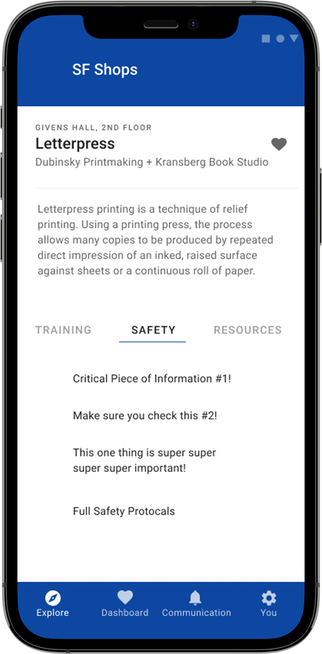
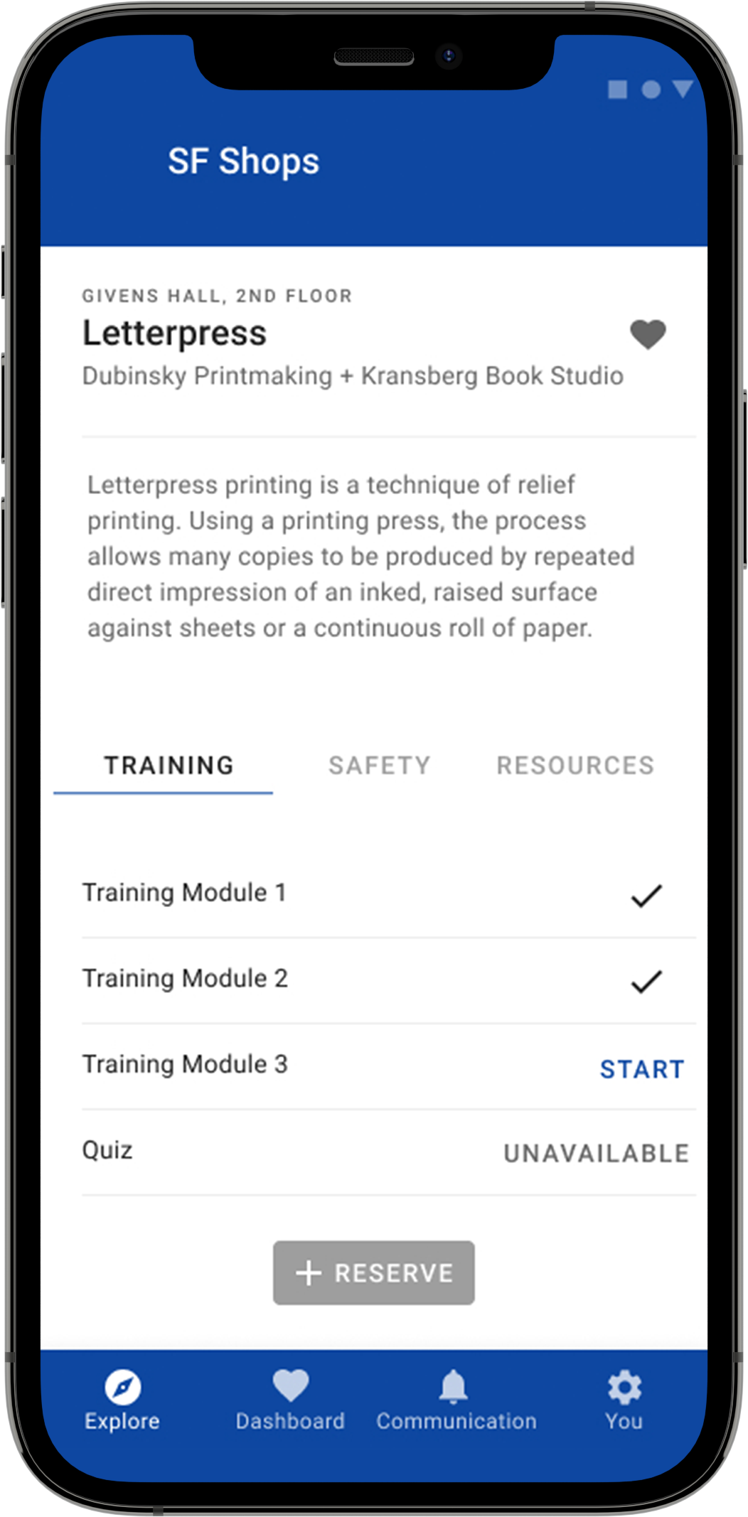
Each piece of equipment has its own page to encourage in depth learning. Tabs distinguish the three categories: training, safety, and resources.
Currently, each of the six shops has its own method for conducting trainings. In keeping with the success that was found in one of the existing shop’s processes, online training modules and quizzes (that could be routinely updated by shop technicians) would be accessible on the correlating equipment pages. The safety tab allows the shop technicians to highlight critical pieces of information, as well as provide access to full safety protocols. The resources tab shows example projects, further learning opportunities, and similar tools.
Currently, each of the six shops has its own method for conducting trainings. In keeping with the success that was found in one of the existing shop’s processes, online training modules and quizzes (that could be routinely updated by shop technicians) would be accessible on the correlating equipment pages. The safety tab allows the shop technicians to highlight critical pieces of information, as well as provide access to full safety protocols. The resources tab shows example projects, further learning opportunities, and similar tools.
Reservation Flow
Making a reservation can be accessed from a variety of touchpoints around the app. After searching for the desired space or equipment, the user is presented with a clear, 4-step process to make a reservation.
Step 1: Select a Date shows a calendar availability far in advance to allow professors and faculty to plan for their classes or for students to plan around busy times in their schedules.
Step 2: Select a Time presents only available time slots. Each shop requires different average lengths of reservation time, so shop technicians would be able to individually determine reservation time slot lengths to reflect their shop’s culture.
Step 3: Materials is included for shop techs to be able to track the amount of material being used. The ability to estimate when material will need to be ordered was expressed as a desire for shop techs. The ability to have data, for individual shops and collectively, will allow for this.
Step 4: Confirm allows the user to edit any previous steps and send a calendar event to a designated email address.
The reservation page will indicate whether or not there is another reservation right after the user, allowing the user to adjust their clean up time accordingly with respect to the following reservation.
Final Deliverable
Feedback
Next Steps
Feedback
Next Steps
The final deliverable is a hi-fidelity, interactive mockup of the application.
View full prototype︎︎︎
Feedback: Google UX designers, shop techs and users all offered postive feedback about the final prototype. The UX designers said a strength of the app was how it worked as a springboard for real relationships. The shop techs were encouraged and excited about the possibilities and communication abilities, as well as the overall connected-ness between the apps.
Next steps could include building out the administrator side to the application (currently the mockup is only students/faculty facing), testing this mockup in a physical setting (not just over zoom, to see how features such as check in/check out function in a real space), and include an “explore by process” filter (which is a common way people phrase questions to shop techs, “how do I cut this? What should I use to drill this?”), and a desktop version.
Thank you!
Many thanks to...
My advisors (Jonathan Hanahan, Molly Needelma, Aaron Zemach, Will Bates), Google UX Designers/Researchers, Shop Technicians/Faculty (Jason, Brady, Matt, Amy Hauft, Drew, Amelia Jones) and my classmatesfor their support, feedback, and generosity with their time!
My advisors (Jonathan Hanahan, Molly Needelma, Aaron Zemach, Will Bates), Google UX Designers/Researchers, Shop Technicians/Faculty (Jason, Brady, Matt, Amy Hauft, Drew, Amelia Jones) and my classmatesfor their support, feedback, and generosity with their time!